

The Goal:As Mrs. Green Apple begins to grow internationally, the more fans want to find their music. The goal was to create a listening and ordering experience that listeners wouldn’t get from normal music streaming sites, and create an easy way for the band to connect with fans.
Connected:
When users go to an artist’s website, it was a way for fans to stay connected with them; whether that be through updates or messages from band members.
Creativity:
An artist’s website should stand out and be unique. What can their website provide that other websites can’t?
Unique purchases:
If fans buy items from their favorite artists, it has to be unique. What can buying an album include that free streaming services doesn’t have?
Cluttered Navigation:
Although some have said it was nice having everything on the same page, it makes it harder to navigate.

Persona:Tina Ng
Problem statement:Tina Ng is a music loving graphic designer who needs confidence in her album purchases Because she wants to listen and support her favorite band.

Site Map:
My goal was to create an information architecture that would help build a strategic flow and navigation. It also played a role in how I designed each page because it helped me understand where things should go logically.
User Journey Map:
I create a user journey map to identify pain points and improve possible opportunities within the website. This also helped create empathy for the users and target audience.

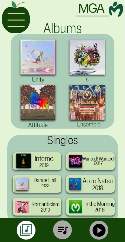
When I was designing the main page for Mrs. Green Apple, I thought about current streaming sites, and how I could make this website stand out.
Since the page is for a band, I thought the page should show the band's identity, while still being easy to navigate.
One inspiration I took was from the artist 'Amine'. His website is designed to look like a phone home screen, where different apps lead to different information.
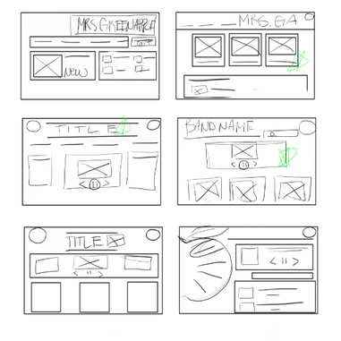
From paper to digital wireframes, it became easier to imagine the flow through the pages. The more I designed, the more I realized some aspects didn’t work, so redesigning was the best option.-For example: what should be on the home page, and what should be removed.

The main pages are connected through the navigation apple. The design and layout has been changed based on user feedback and suggestions.
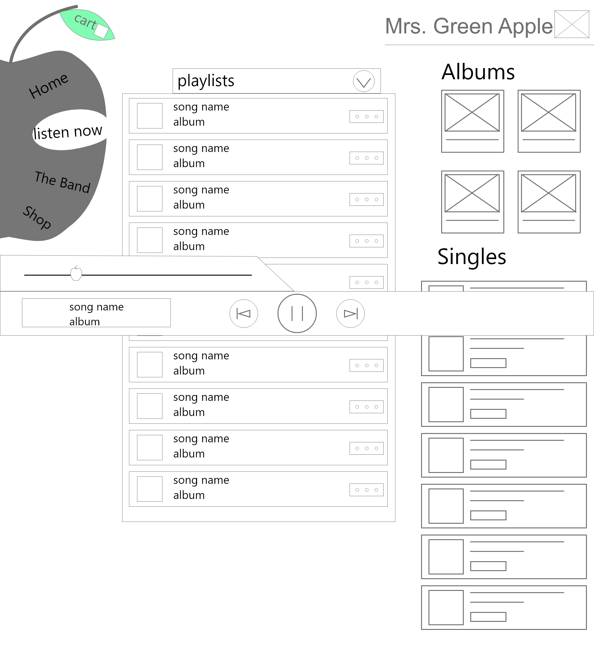
Low-fidelity prototype

Study type: Unmoderated Usability study
Participants:
4 participants: 2 female, 2 male
Location: remote, United States
Length: 20-30 minutes
Confusion with Content:
The biggest issue was confusion between “Listen now” and Discography. Most testers didn’t know the difference, or why it was necessary to have the separation.
Ease of Navigation:Testers found they wanted to browse through music while listening, but found navigation frustratingly impossible. Spotify was brought up as an example, and being able to be in complete control of music and knowing where users are in the website was very important.
The biggest issue most people find was confusion between the ‘Discography’ page, and the ‘listen now’ page. Combining both pages put all similar content in the same area, making the website as a whole easier to navigate.


1. Ensure that the font styles and sizes accommodate for those with hard of sight
2. Have customizable options that can adjust animations and sounds
3. Have alt text available for each page and screen reader access
“This was super cool. The design seemed strange to me at first but it grew on me quickly and I love how unique and fun it is. The attention to detail with effect is on point too!“
-User Tester
The main goal for this design was to create a unique experience for fans and listeners of Mrs. Green Apple that reflects the band. I wanted the band's site to be an enjoyable experience while still being functional and easy to navigate.
The next step
When designing for the main listening page, I got stuck between what I thought was practical versus what was functional. I thought separating certain elements would have made navigation easier for users --such as the discography and the listening page--, but after the usability study, found that grouping similar items together made navigation easiest. I learned that the less elements for users to sort through on a page, the easier it is for them to navigate through.
I found it is important to understand that the designer's wants are not always what the user needs.
If you like what you see and want to work together, get in touch!
nicolenguyenx98@gmail.com