

Redesigned app and thought process after Certificate ↓

The Problem:
While Nature's Best Cafe has a website, it lacks a usable and functional menu: a scanned picture with small text and no ability to zoom. They have a catering menu, but it's a confusing layout with no information about the food. Overall, the lack of information and cluttered layout of the website makes it difficult to navigate.
To give the restaurant an updated way to view the menu, improve the way to order food, and to give customers confidence in their order.


A flow chart helped with understanding how customers would interact with the app; by roughly going through the process myself, I could see what decisions would be made, what obstacles they would encounter, and how to design for them
.png)
I started by conducting competitive audits comparing Nature's Best Cafe to direct and indirect competitors. I focused on local restaurants that had similar features to Nature's Best Cafe such as healthy options. To understand how and why higher brands are successful online, I also analyzed Panera Bread's website and app.

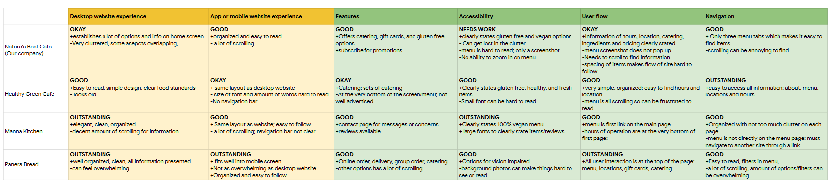

Upon questioning and observation, the typical clientele at Nature's Best Cafe ranges from middle school students, to older generations, with most of them being returning customers. With this in mind, I aimed to design the app to be user friendly for everyone.
Interviews were conducted to gain an insight in people’s diets, how they meet their dietary needs, and if there are any issues when they order out. The research showed most working adults who have goals to be healthy don’t have time to make healthy meals at home due to their schedule; When they order food online, they don’t feel as confident in if its healthy or not. When they do order, they want the transaction to be quick and efficient.
.png)
Problem Statement:
Clara Moore is a busy nurse practitioner who needs fast, healthy food because she has no time to make her own meals that meet her diet.


Following Clara’s user journey gives insight in where customers can get frustrated and why. This helped me gain more empathy for customers, and how they would use the app.

I started listing out what necessities the app should have and started designing from there; I wanted to make the menu page the splash page so that is the design I started with. With each design, I marked parts I liked and put them together for later designs.
I also took inspiration from their 'specials and seasonal' board of their physical menu at the restaurant. By adding this to the design, I thought it would be a more immersive experience for the customers.
Digital Wireframes
As I designed, I thought about how customers can find food they like, and order items quickly. I wanted the menu page to be easy to read and navigate so that they user knows exactly where they are.
One of the bigger debates I had was whether to start out with a filtered option for the different types of food, or start out with the menu where customers can immediately browse through the menu
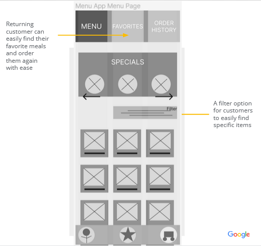
The food information pops up with pictures, description, and adding it to the cart.
Customers can feel confident in the foods they choose that meet their dietary needs; the tags show the type of food it is


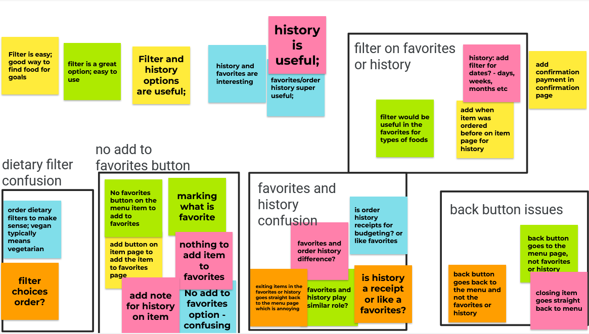
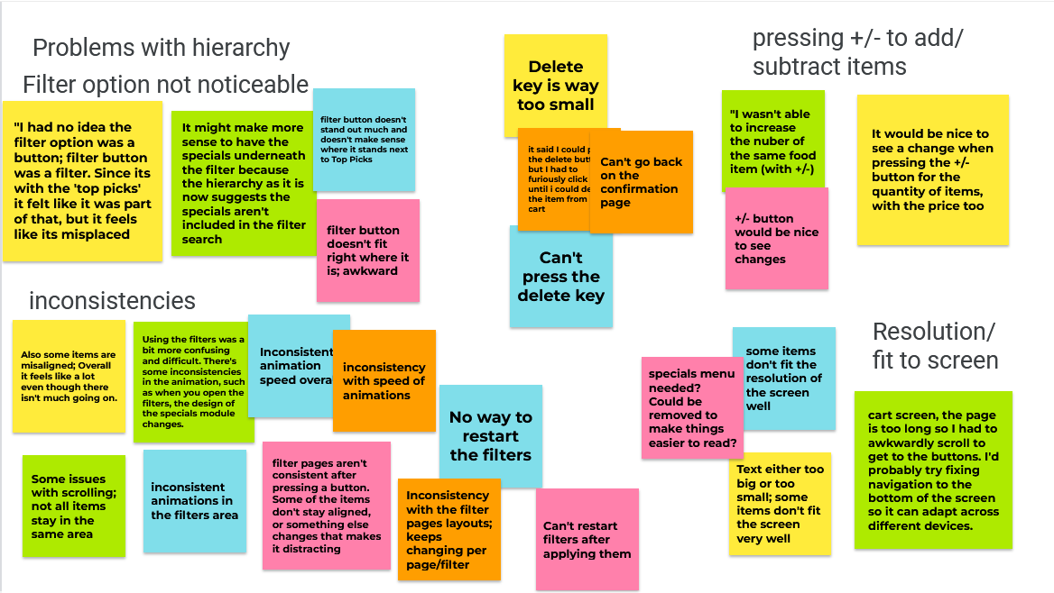
There were two rounds of usability studies. The first round of the study focused on the low-fidelity prototype and if the design was usable and functional. The second round focused on the high fidelity prototype, and if the experience was consistent, and if any changes were needed.

I chose the colors of the mockup to match the website as best I could.
To make a more personalized experience for the customer, a heart could be clicked to favorite an item, and the date of the item previously ordered. There is also a quantity amount the customer can add directly from the pop up card
To make the popup card easier to read, I applied space between the price and the quantity counter.
The ‘specials’ section didn’t add much to the home screen and only took up space so I got rid of it.
Since the filter button was also confusing to users, I replaced both with a collapsible menu filter. This way, it takes up less space, and is easier for users to navigate.


.png)
The food app based off Nature’s Cafe is a personal experience for customers. For returning customers, it makes it easy for them to efficiently order their favorite menu items; at the same time, it can be used to find new foods that haven’t been ordered yet.
Quote from feedback:
“I really like the idea of favoriting items and having its own section. I don’t see that option on the food apps I use, and since I typically order the same foods, it would make things much smoother.”
Throughout this process, I learned how to balance space and what I want on a page. What I thought would be useful to the user ended up cluttering the space I was designing in.
Although thinking about the user is important, I thought too much about how to make an easy-to-navigate experience by adding what I thought was important to the same page. I learned to prioritize the needs of the user over what I think the user needs.
This also helps prevent the page from getting congested and is easier to read.
Conduct another round of usability studies to see if the problems were addressed, and to see if there are other issues.
Design a receipt page that gives the customer all information about their order: from the items, to how their receipt looks to the restaurant. This gives them full confidence in their order.
Design the profile page and settings page to help customers customize their preferenes and information.
This was my first UX project in the Google UX Design Professional Certificate. After completing the certificate, I went back to design the menu page to see how my design thinking had changed. My main goal was to make the screen easier to navigate. Rather than the drop down menu filter, the filter is available immediately for customers to find the types of food they want.
Similarly, the side bar menu replaces the the buttons at the top of the screen making the screen less congested.

If you like what you see and want to work together, get in touch!
nicolenguyenx98@gmail.com